Graphing r/Investing and r/WallStreetBets
A look into graph representations of r/Investing and r/WallStreetBets, often seen as representative of the bear vs bull market sentiments of reddit. Hopefully, from these representations we can cluster Users, Posts, and Stocks by semantic similarity while ranking each by their influence on the social network of each specific subreddit. The clusters and rankings should be able to then tell us which stocks are being promoted together, in which posts and by whom and how they differ between these 2 communities.
TL;DR some interactive dashboards for Investing and WallStreetBets of the final clustering and rankings (use the symbols chart on the top left to navigate).

For both, the top 20 posts were extracted for each day from Jan 1 2020 — Feb 28 2021. For Investing, 8,411 posts were extracted with 777,516 comments from 104,605 users. For WallStreetBets, 8,380 posts were extracted with 2,219,525 comments from 288,645 users. The differences in the number of comments is likely from the size of the subbreddits (1.7M vs 9.5M) and reddit’s default clipping of the response trees based on its own metrics.
Constructing the Graph
Reddit is already a graph, there are posts, a tree of replies, and users who made those replies. In addition, we will need to extract and link nodes representing stock symbols and pivot the graph to better model the social interactions between users and stocks.
So for every post such as this simple example of a single branch:

We will create 1 post node, 4 user nodes (AutoModerator, UserA, UserB, UserC), and 3 symbol nodes (BRK.B, DGRO, GME).
Edges connecting the users and symbols to the single post node will be created where edge weights will be inversely proportional to depth, so AutoModerator → Post will have an edge weight of 1, UserA → Post will have an edge weight of 1/2, UserB of 1/3, and UserC of 1/4. Similarly for BRK.B and DGRO with weight of 1/3 and GME with a weight of 1/4.
Edges will also connect the users to those they responded to in the reply chain and weighted similarly. UserA → AutoModerator with a weight of 1, UserB → UserA with a weight of 1, UserB → AutoModerator with a weight of 1/2 and so on. Users are further connected to symbols mentioned in the reply chain such that UserC → GME with a weight of 1, UserC → BRK.B, DGRO with a weight of 1/2 each, and UserB → BRK.B, DGRO with weight of 1 each.
The resulting graph for a post will looking something like this with the post in green, symbols in beige, and users in blue.

The resulting graph for r/Investing is a graph of 116,696 nodes and 3,803,470 edges; and for r/WallStreetBets a graph of 300,604 nodes and 11,616,316 edges.
Clustering and Ranking
That was a graph of 50 nodes, considering the full graphs of up to 300,00 nodes, we first need to cluster and rank the nodes so that we can segment and consider individual subgraphs.
Using Louvain modularity were able to cluster the graph (such that each node can only belong to a single cluster) for 2 purposes. Using the directed graph with only edges into Symbols from Users and Posts, we’re able to form clusters containing many Posts and Users, but only one Symbol. This clustering allows us to query the graph for specific stock Symbol such as for BRK.B to find the most influential Posts and Users for that symbol.

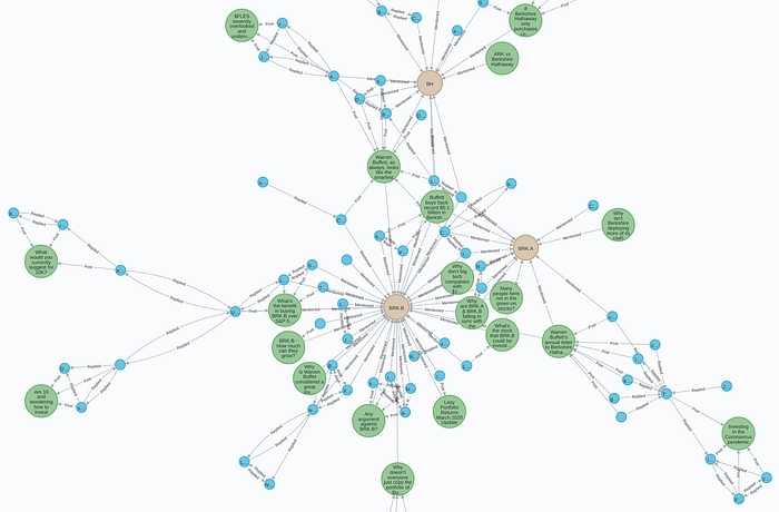
By changing the edge into Symbols to be directionless before clustering, we can now also query for similar Symbols where we find BRK.A, BRK.B and BH clustered in the same community.
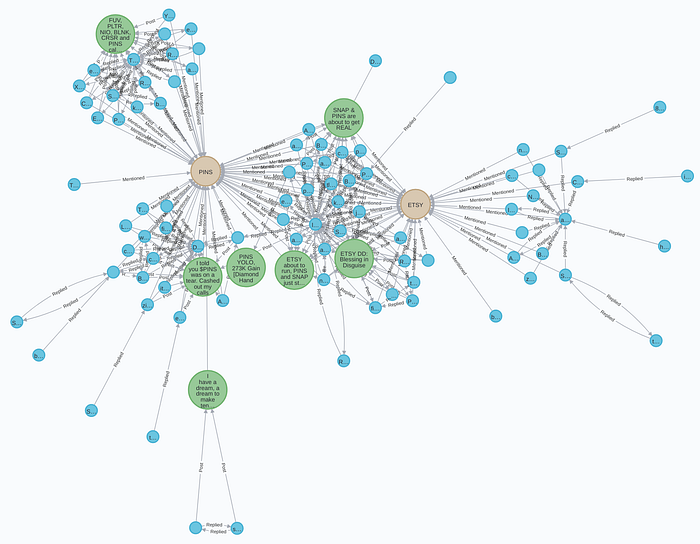
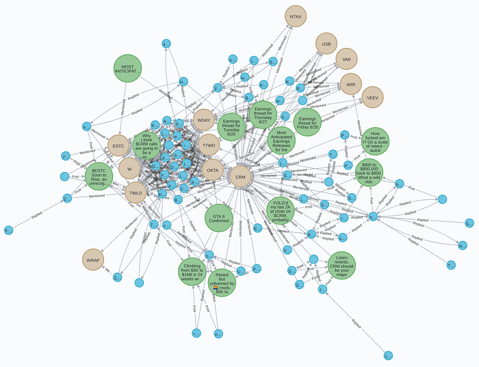
Another one in r/wsb showing the clustering of PINS and ETSY together in a single community and CRM with several enterprise cloud companies such as OKTA, TWLO, VEEV, and WDAY.
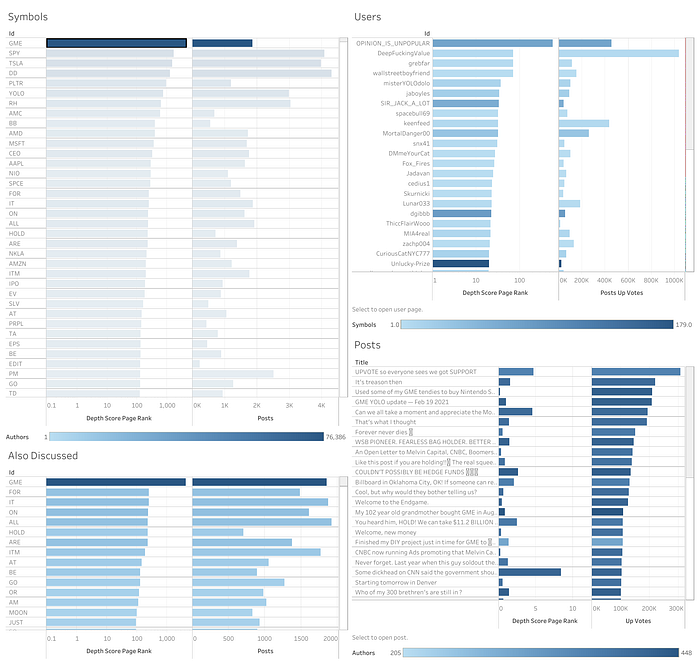
Now we can query for top Posts and Users by Symbol as well as similar Symbols based on common Users and Posts. PageRank weighted by the edge “depth score” can then be used to sort the results as these subgraphs also get pretty big.
We can drop these results in dashboards (for r/Investing and r/WallStreetBets) to more easily explore the communities. Selecting a symbol in the top left will filter the 3 other charts for top Users and Posts for that Symbol as well as similar Symbols.
A quick sanity check with u/DFW as #2 by page rank for GME in r/wsb.
Upvotes for Weights and Sentiment
Upvotes seems like a clear choice for edge weights and are often used for “sentiment” classification of posts in these subreddits with positive meaning bullish and negative meaning bearish. However, I think upvotes are more synonymous to popular agreement vs sentiment. I can say a particular stock is going to crash, a bearish sentiment, and be upvoted for agreement or a particularly unliked stock going to moon and be downvoted.
Similarly, upvotes as weights (although extracted into the graph) seems to confer more popular agreement to the specific post or reply rather than how strongly those Users, Posts, and Symbols are related. The inverse depth score seems to work well although there are edge cases.
Symbol Recognition
Stock symbol recognition in text is actually non-trivial. There are around 9000 symbols across the top 3 exchanges with many being the same as common words and acronyms from HOLD to CEO to DD to YOLO.
A mildly strict regex of looking at all uppercase words or those starting with $ or containing a : (as in NYSE:PLTR) seemed sufficient but a definitely resulted in many false positives as can be seen with YOLO and DD topping the Symbols lists.
A more robust approach would be something like a custom trained NER model that takes the grammar of the sentence into consideration.
The Code
https://github.com/zuyezheng/RedditSentiment
Subgraphs


